//
Subscribe to the Tabnine newsletter
//
Get news and updates about AI, software development, and more.

Why reinvent the CSS wheel when the wheel has already been invented – not once, not twice, but multiple times through frameworks such as bootstrap, Foundation, Tailwind, Bulma, and Semantic UI. But there is one UI framework that stands out among the crowd: Material-UI.
Material-UI is designed for rapid prototyping, increasing overall software development velocity, and creating user interfaces at speed. It helps developers spend more time on the logical layers of their apps rather than wrangling with CSS-related interface elements. The perk of Material-UI is that it is made for React. But what is React, and why is it unique?
React is a JavaScript library for building user interfaces. According to Statista, it is now the most popular front-end development framework, surpassing jQuery, Express, and Angular. React is unique because it lets you create reusable components to make your code easy to read and maintain. When a user interacts with a React component, React updates the component automatically, which makes your app more responsive and fast.
By design, React components are small, independent code pieces defined by their functionality, such as forms, menus, or buttons. A component is a self-contained module that renders some UI. React was created to solve issues faced when building large applications with data that changes over time.
Building large applications is different from traditional “imperative” programming, where you have to write code that explicitly tells the program how to update the UI. React takes a declarative approach because it makes your code more readable and easier to manage.
With React, you just describe how the UI should look at any given point in time, and this library will take care of the rest. React will automatically update the UI when the underlying data changes to reflect the changes, which makes your code more straightforward. So, where does Material-UI comes in?

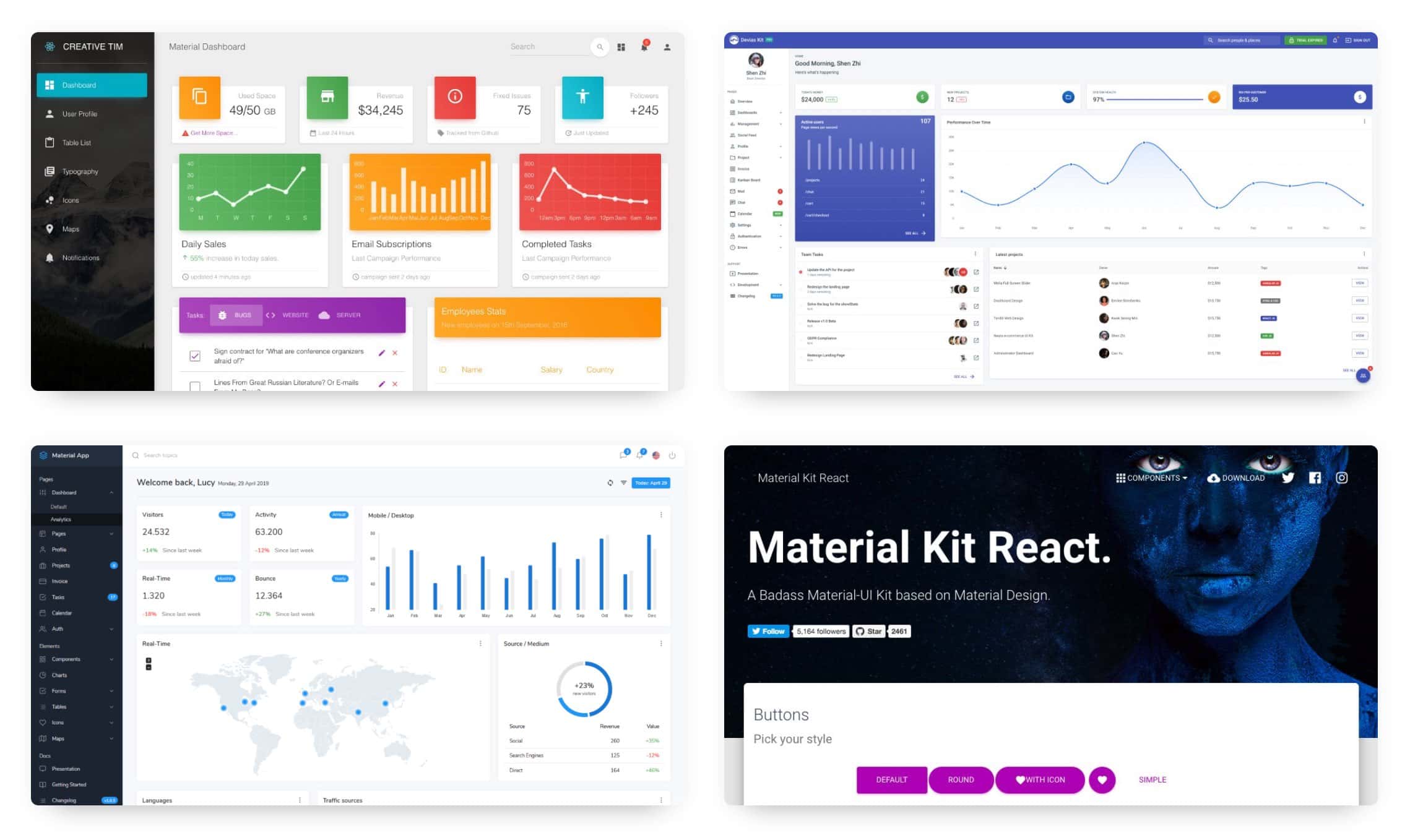
Material-UI is a UI framework for React that offers a wide variety of ready-made components that can be used in your React project. Developers can use these components with the Material-UI styling library, also available in the React world.
One of the great things about Material-UI is that it offers a wide variety of components that can create almost any type of UI imaginable. For example, you can find essential components like buttons, cards, sliders, and more complex ones like dialogs, grids, and Tooltips.
In addition, Material-UI comes with a built-in theming system that makes it easy to create custom themes for your app. You can also use the Material-UI styled-components library to style your own React components without using Material UI at all.
Material-UI has a lot of interesting features that may be of help when developing websites and apps.
One of the main advantages of Material UI is that it is interoperable with different styling systems. This interoperability means that developers can use the library with varying frameworks of CSS or even with vanilla CSS.
For example, let’s say you are using Material-UI in a Bootstrap CSS framework project. You can use the class Name property to add the Bootstrap classes to the Material-UI components. This will ensure that the styles from Bootstrap are applied to the Material-UI components.
Similarly, you can use the style property to add inline styles to the Material-UI components. This is useful if you want to override the default styles of the components or if you are using a CSS framework that does not include a Material-UI theme.
Material-UI offers a set of pre-built components that help you create beautiful websites and apps while saving time and increasing your productivity. All you need to do is choose the right component for your project, and you’re ready to go!
There are a wide variety of Material-UI components available, so you’re sure to find one that fits your needs. Here are a few examples:
Whether you’re building a website or an app, Material-UI has the pre-built components you need to create a beautiful, user-friendly interface.
The ability to easily customize the look and feel of Material-UI is one of its key selling points. The wide range of ready-made themes and component styles means that there’s usually something to suit everyone’s needs, but sometimes you need something a little bit different.
With a few lines of code, it’s possible to create your own theme or even customize individual components to get things looking just the way you want.
Creating a custom theme is straightforward. First, you’ll need to create a file called theme.js in the src directory of your project. In this file, you’ll export an object which contains the overrides for the default Material-UI theme.
import { createMuiTheme } from '@material-ui/core/styles';
export default createMuiTheme({
palette: {
primary: {
main: '#ff4400',
},
secondary: {
main: '#00bbff',
},
},
});
As you can see, we’re importing the createMuiTheme function from @material-ui/core/styles, and we’re using it to create a new theme object. We can then override the palette property to change the colors used.
Once you’ve exported your theme object, you can import it into your application and use it by wrapping your root component in a ThemeProvider component, like this:
import React from 'react';
import { ThemeProvider } from '@material-ui/styles';
import theme from './theme';
function App() {
return (
<ThemeProvider theme={theme}>
<div>
{/* your application code here */}
</div>
</ThemeProvider>
);
}
That’s all there is to it! Now, all of your components will use the colors defined in your custom theme.
It’s also possible to customize individual components without having to create a whole new theme. For example, let’s say you want to change the appBar color. You can use the withStyles HOC to do this:
import React from 'react';
import { withStyles } from '@material-ui/styles';
import AppBar from '@material-ui/core/AppBar';
const styles = {
root: {
backgroundColor: '#ff4400',
},
};
function CustomAppBar(props) {
const { classes } = props;
return (
<AppBar className={classes.root}>
{/* your app bar code here */}
</AppBar>
);
}
export default withStyles(styles)(CustomAppBar);
Here, we’re using the withStyles HOC to inject a classes prop into our CustomAppBar component. We can then use the classes object to access the styles we defined earlier.
With ever-growing popularity of Material-UI, its developers release new updates on a regular basis. New features and components are available for developers to use with each release. The library is also updated regularly to prevent and solve any bugs that are discovered.
This means that developers who use Material-UI can always access the latest features and components. They can also rest assured that any bugs that are discovered will be fixed quickly. This makes Material-UI a very reliable option for developing modern applications.
Some of the features in the latest release include: new grid breakpoints, improved typography, increased spacing, and a new color palette. These are just a few of the many new features that developers can take advantage of.
All of these new features and updates make Material-UI an essential tool for developers. With its yearly release schedule, developers can always be sure they are using the latest and greatest version.
Material-UI is a React component library that provides a handful of great user interface elements that can be used in your React projects. While the documentation support level is not perfect, it is definitely improving, and there are a number of ways that you can get help when you need it.
The first place to look for help is the Material-UI website itself. The website has a fairly decent documentation section that can be helpful for getting started with using the library. There is also a community section where you can ask questions and get help from other Material-UI users.
If you need more help than what the website can provide, there are a number of Material-UI-related YouTube channels that can be helpful. React Meteor is a channel that provides video tutorials on using Material-UI, and the React FortAwesome channel also has a few helpful videos on the topic.
Here are some code snippets to help you get started with using Material-UI in your React app.
import React from 'react';
import { SvgIcon } from 'material-ui';
const HomeIcon = (props) => (
<SvgIcon {...props}>
<path d="M10 20v-6h4v6h5v-8h3L12 3 2 12h3v8z" />
</SvgIcon>
);
export default HomeIcon;
Material UI Fonts
import React from 'react';
import PropTypes from 'prop-types';
import { withStyles } from '@material-ui/core/styles';
import Typography from '@material-ui/core/Typography';
const styles = theme => ({
root: {
...theme.mixins.gutters(),
paddingTop: theme.spacing.unit * 2,
paddingBottom: theme.spacing.unit * 2,
},
typography: {
useNextVariants: true,
},
});
function IntegrationReact(props) {
const { classes } = props;
return (
<div className={classes.root}>
<Typography variant="h5" component="h3" align="center">
This is a sheet of paper.
</Typography>
<Typography variant="body2" component="p" align="center">
Paper can be used to build surface or other elements for your application.
</Typography>
</div>
);
}
IntegrationReact.propTypes = {
classes: PropTypes.object.isRequired,
};
export default withStyles(styles)(IntegrationReact);
import TextField from '@material-ui/core/TextField';
function MyComponent() {
return (
<TextField
id="standard-basic"
label="Standard"
margin="normal"
/>
);
}
import React from 'react';
import { makeStyles } from '@material-ui/core/styles';
import Card from '@material-ui/core/Card';
import CardActions from '@material-ui/core/CardActions';
import CardContent from '@material-ui/core/CardContent';
import Button from '@material-ui/core/Button';
import Typography from '@material-ui/core/Typography';
const useStyles = makeStyles({
card: {
minWidth: 275,
},
bullet: {
display: 'inline-block',
margin: '0 2px',
transform: 'scale(0.8)',
},
title: {
fontSize: 14,
},
pos: {
marginBottom: 12,
},
});
export default function SimpleCard() {
const classes = useStyles();
const bull = <span className={classes.bullet}>•</span>;
return (
<Card className={classes.card}>
<CardContent>
<Typography className={classes.title} color="textSecondary" gutterBottom>
Word of the Day
</Typography>
<Typography variant="h5" component="h2">
be{bull}nev{bull}o{bull}lent
</Typography>
<Typography className={classes.pos} color="textSecondary">
adjective
</Typography>
<Typography variant="body2" component="p">
well meaning and kindly.
<br />
{'"a benevolent smile"'}
</Typography>
</CardContent>
<CardActions>
<Button size="small">Learn More</Button>
</CardActions>
</Card>
);
}
import React from 'react';
import { makeStyles } from '@material-ui/core/styles';
const useStyles = makeStyles((theme) => ({
root: {
backgroundColor: theme.palette.background.default,
},
}));
function MyComponent() {
const classes = useStyles();
return <div className={classes.root}>This is my compoent</div>;
}
Material-UI is fantastic for businesses, startups, and app developers that are looking to get up and running as quickly as possible, with the highest level of flexibility and robustness rolled into one simple-to-use framework.
If you’re not already using Tabnine’s AI-driven plugin, you should definitely check it out. This plugin is more than just another autocomplete – it is a machine learning driven AI system that figures out your project’s code patterns and makes helpful suggestions based on best practices. Tabnine can help your team integrate faster, better, and more succinctly, helping you achieve better outputs and efficiently reducing cognitive load so you can focus on constructing the right solution for your app.
Explore recent posts
//Explore recent posts
//
6 -min read

16 -min read

4 -min read

More How-to's
//3 -min read
3 -min read
3 -min read